Bold color in a luxury kitchen is like a statement suit—done right, it’s unforgettable. Done wrong, it’s like wearing neon Crocs to a gala.
I’ve helped people create kitchens that mix deep navy with brushed gold, emerald green with marble, and matte black with blush pink.
The key is intentionality. A bold color scheme isn’t just about being loud. It’s about crafting a space that feels confident and elegant.
So, if you’re considering deep teal cabinets or dreaming of a rich burgundy island but worry it might scream “Pinterest fail,” get ready. We’ll design something daring and timeless.
Step 1: Decide on Your “Bold”
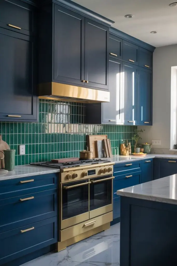
Before you pick paint, figure out what bold means for you. It’s not the same for everyone.
Go Big with Color Commitment
- Full cabinetry in a striking hue (think rich navy, hunter green, charcoal black).
- Colored appliances for a retro-luxe punch.
- Statement backsplash in vibrant tones.
Or Start Small and Layer Up
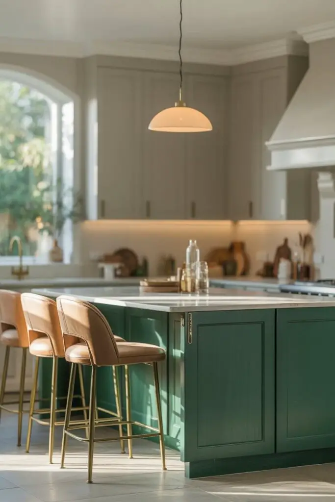
- A color-blocked island against neutral cabinetry.
- Bold bar stools, pendant lights, or even an accent wall.
- Art and accessories in jewel tones for seasonal flexibility.
Pro tip: If you’re commitment-shy, start with a bold focal point (like the island) and keep the rest of the space more neutral. It’s easier to update later without gutting your kitchen.
Step 2: Pair Bold Color with Luxury Finishes
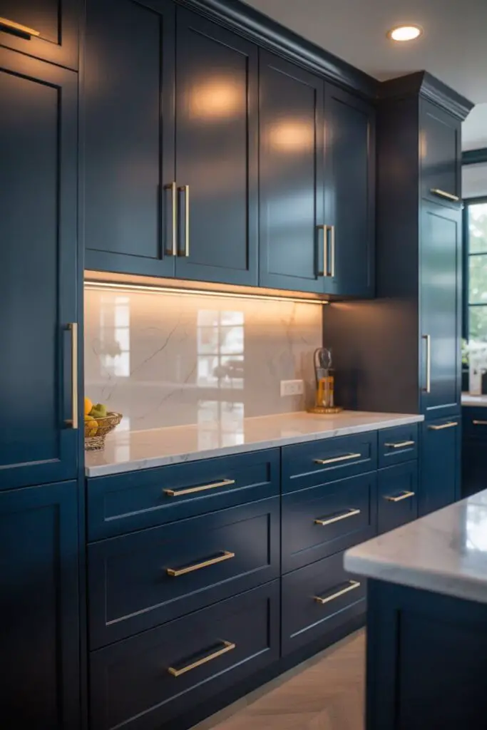
Here’s the thing: bold color by itself doesn’t automatically equal luxury. It’s the marriage between hue and material that seals the deal.
- Deep navy cabinets + brushed gold hardware = rich and timeless.
- Emerald green + marble countertops = sophisticated drama.
- Matte black + natural wood = moody elegance.
Personal note: I once designed a kitchen with burgundy cabinets and unlacquered brass pulls. Guests couldn’t stop touching the hardware like it was jewelry. That’s the magic of texture + tone.
Step 3: Create a Balanced Color Palette
Your bold color needs supporting players — neutrals and accents that make it sing.
Luxury-Friendly Neutrals
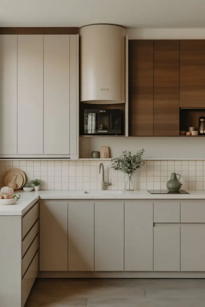
- Warm whites
- Soft greys
- Creamy beiges
- Charcoal
Accent Colors That Work with Bold
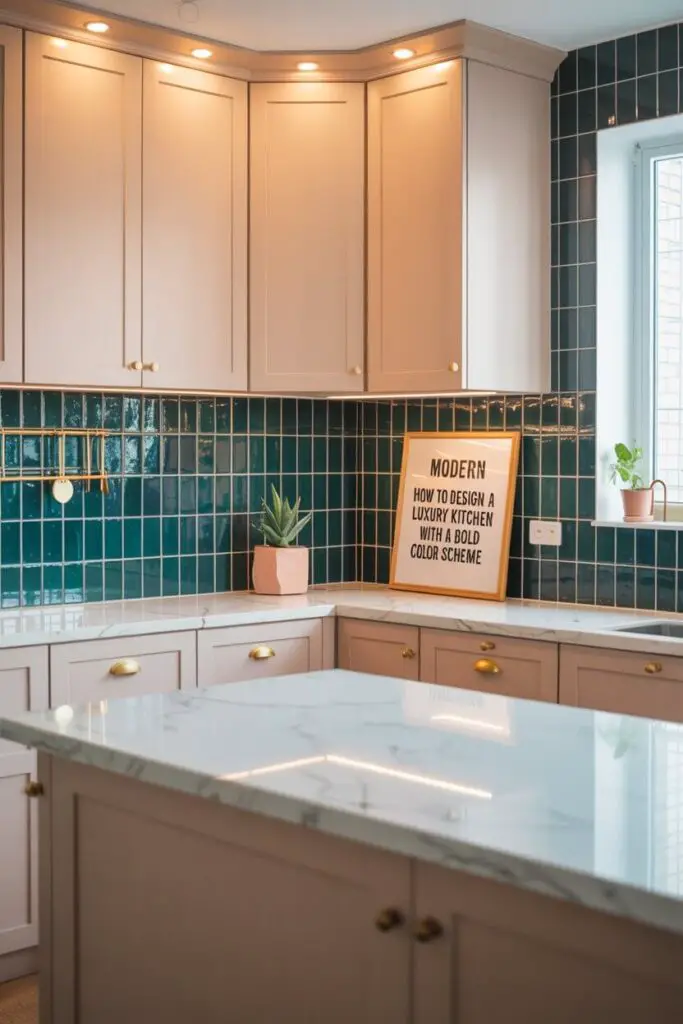
- Warm metallics (brass, copper, champagne gold)
- Soft pastels for contrast (blush, powder blue)
- Deep jewel tones for monochromatic layering
Why it works: The contrast between bold and neutral elements prevents overwhelm and makes the bold choice feel intentional instead of accidental.
Step 4: Mind the Lighting (It Changes Everything)
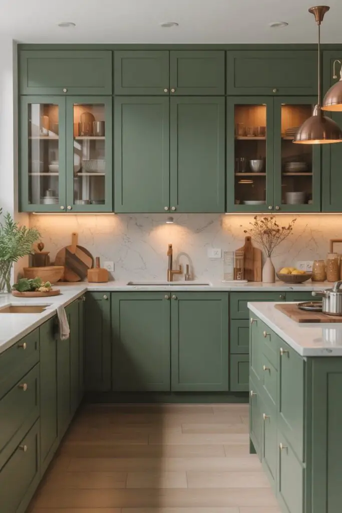
Ever painted a “perfect” color only to watch it turn weirdly green at night? Lighting is the culprit.
Layer Your Lighting
- Ambient: overhead recessed lights or chandeliers.
- Task: under-cabinet strips for prep zones.
- Accent: inside glass cabinets or toe-kick lights to spotlight design features.
Pro tip: Always test your chosen bold color under both natural and artificial light before committing. That emerald you love at noon might feel almost black by 8 p.m.
Step 5: Choose the Right Surfaces to Balance Color
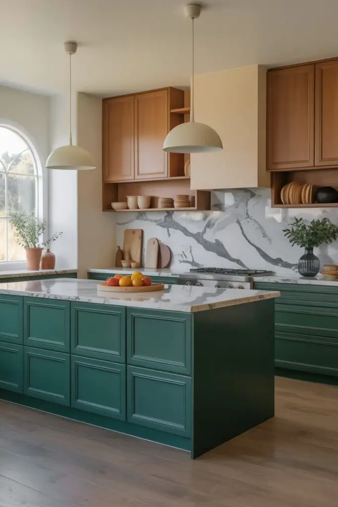
Bold colors pop best when paired with complementary surfaces.
- High-gloss finishes bounce light and make colors richer.
- Matte finishes create a more understated elegance.
- Natural stone offers organic veining that plays beautifully with strong hues.
Example: A glossy midnight-blue island topped with honed white marble is pure luxury meets drama.
Step 6: Decide Where to Place the Bold
The placement of your bold color determines how “loud” it feels.
High-Impact Zones
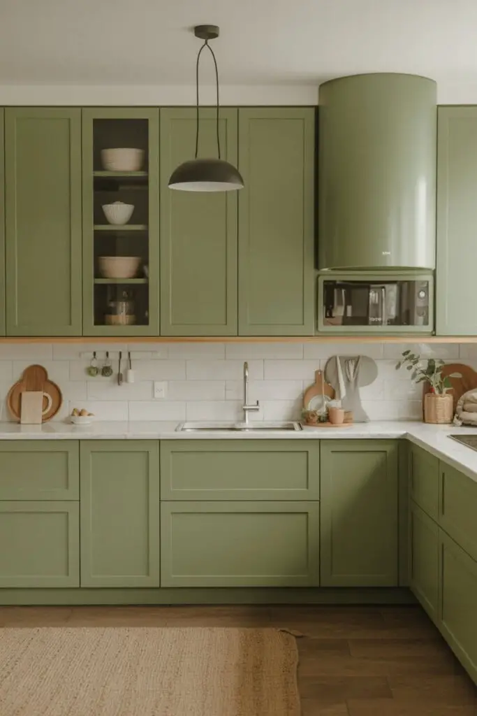
- Full cabinetry runs
- Large-scale backsplashes
- Islands
Medium-Impact Zones
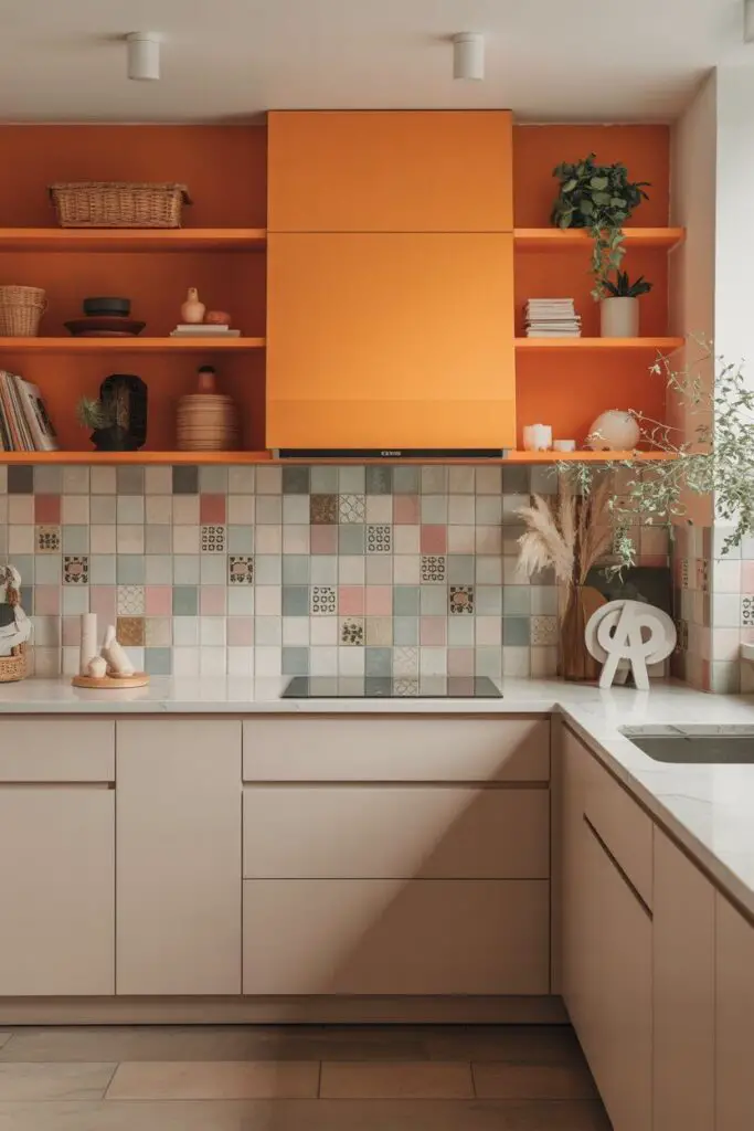
- Open shelving in a bold color
- Statement hoods
- Floor tiles in patterned or colored designs
Low-risk areas: Bar stools, small appliances, and textiles — all easy to swap out if you change your mind.
Step 7: Don’t Shy Away from Dark Colors
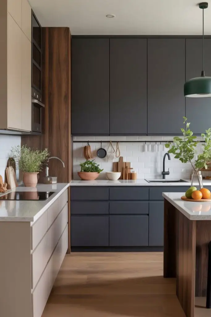
Luxury kitchens can absolutely handle dark, dramatic colors — if you balance them with the right elements.
- Matte black cabinets with white quartz counters.
- Charcoal grey walls paired with rich wood tones.
- Deep navy island against soft neutral walls.
Dark tones exude confidence and look incredible with metallic accents.
Step 8: Use Bold Color to Highlight Architectural Features
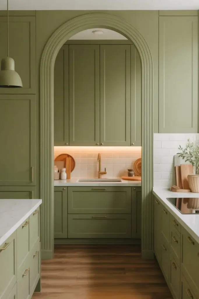
Got stunning millwork, an arched doorway, or intricate paneling? Bold color can turn it into the star of the show.
Pro tip: Painting trim or paneling in the same bold hue as cabinetry creates a seamless, custom look — pure high-end magic.
Step 9: Mix Materials for Depth
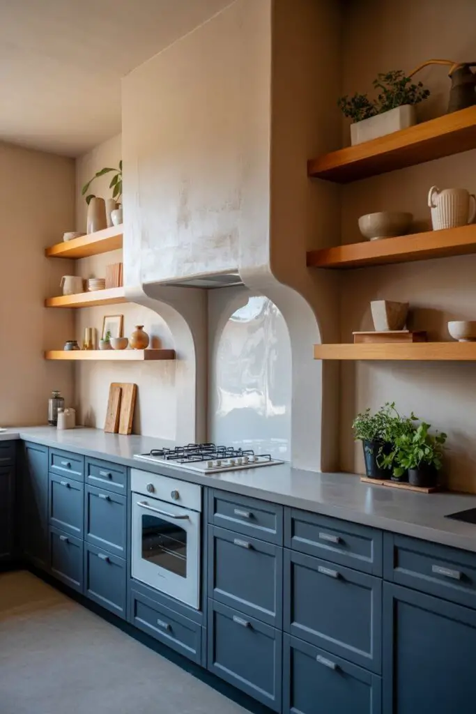
Bold color is striking, but mixing textures makes it luxurious.
- Painted cabinetry + natural wood shelves.
- Glossy backsplash + matte countertops.
- Smooth stone + textured plaster walls.
The mix stops your bold scheme from feeling flat or one-note.
Step 10: Keep Function in Mind (Luxury Means Practicality Too)
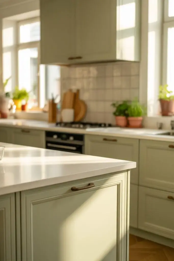
Your bold kitchen still has to work hard.
- Ensure drawers and cabinets open without dinging adjacent finishes.
- Choose durable paint finishes — satin or semi-gloss for cabinetry.
- Pick wipeable surfaces near cooking zones.
Bold should be beautiful and bulletproof.
Step 11: Play with Two-Tone or Color Blocking
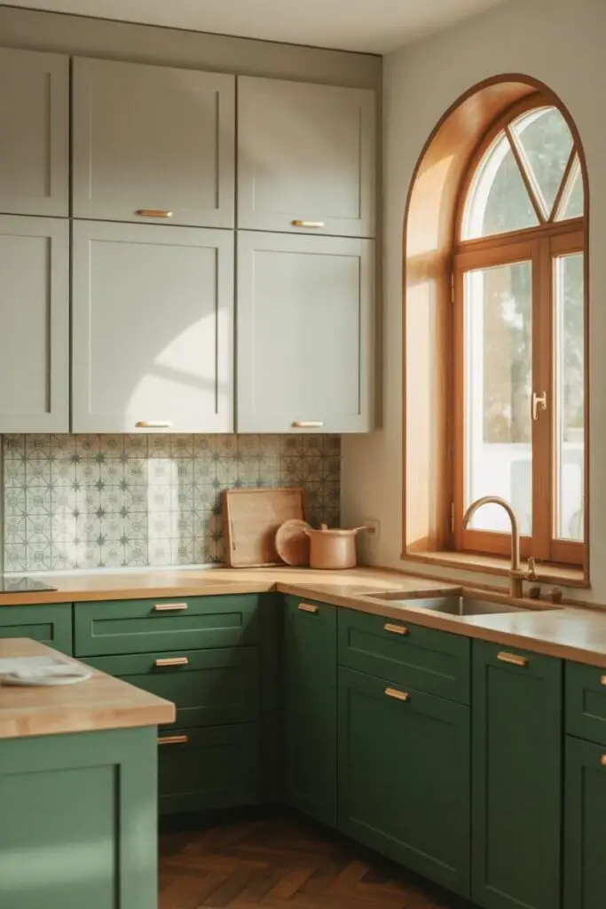
Why stick to one bold color when you can have two?
Two-Tone Ideas
- Upper cabinets in a soft neutral, lowers in a bold shade.
- Island in a bold tone, perimeter in complementary color.
- Backsplash in a patterned tile combining both.
FYI: Keep both colors in the same undertone family for harmony.
Step 12: Add Warmth Through Accessories
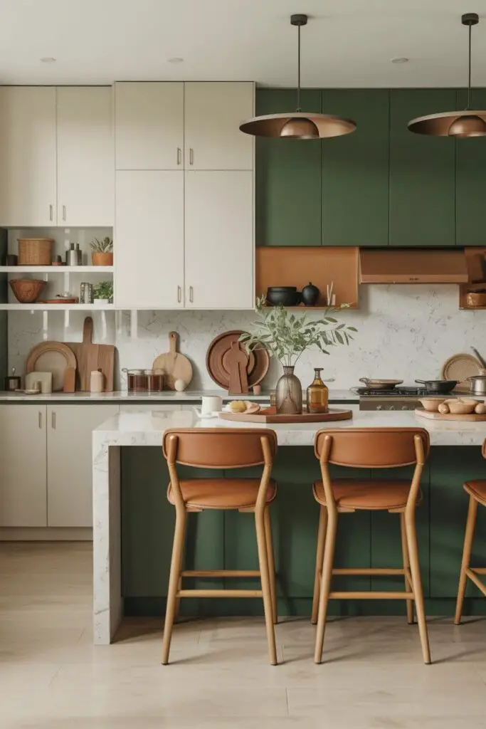
Bold colors can feel stark without warm accents.
- Wooden cutting boards
- Brass or copper hardware
- Warm-toned textiles
Personal anecdote: I once had a black-and-white kitchen that felt cold until I added a warm leather bar stool set. Instant difference.
Step 13: Think Long-Term Timelessness
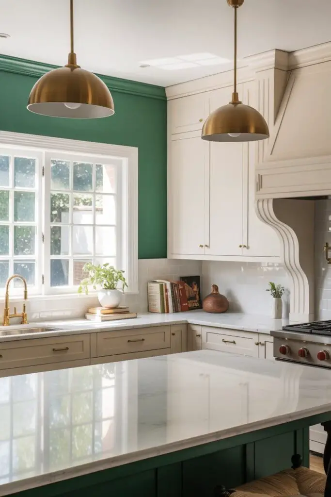
The fear with bold color is that it will date quickly. Here’s how to avoid that:
- Stick to classic bolds: navy, emerald, burgundy, black.
- Avoid ultra-trendy colors unless you truly love them.
- Pair with timeless materials like marble, quartz, or solid wood.
Step 14: Layer in Luxury Lighting Fixtures
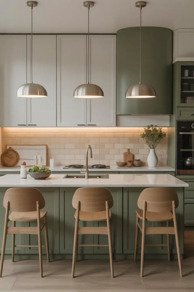
Bold color + statement lighting = chef’s kiss.
- Oversized pendants over islands in complementary metallics.
- Chandeliers in mixed materials.
- Integrated LED strips for subtle glows.
Lighting doesn’t just illuminate; it frames your color.
Step 15: Sample Before You Commit
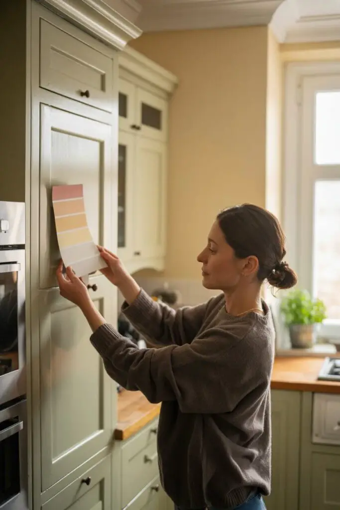
Please don’t skip this step.
- Order large paint swatches or sample pots.
- Test on cabinets, walls, and trim.
- View at different times of day for true color read.
Step 16: Coordinate with Adjacent Spaces
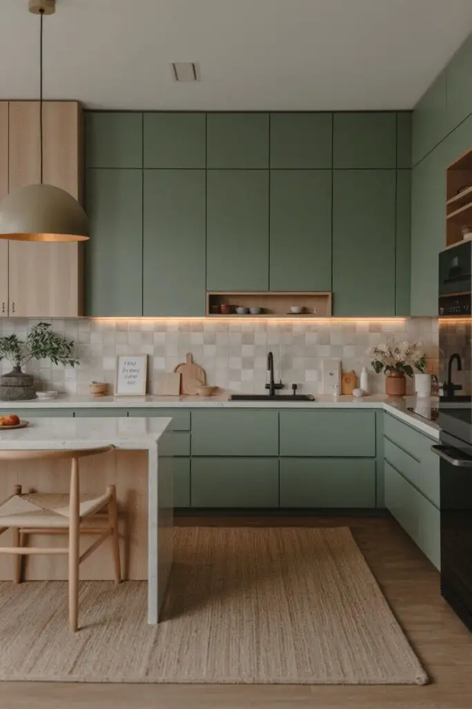
Open floor plans demand flow.
- Pull accent colors from your kitchen into adjoining rooms.
- Keep undertones consistent for a seamless transition.
This way, your bold kitchen feels connected, not isolated.
Step 17: Make It Personal
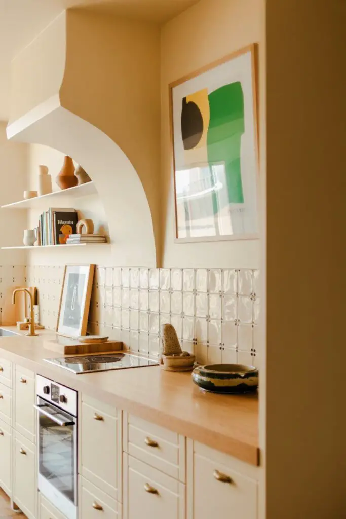
A bold luxury kitchen should reflect you.
- Use a favorite color from your wardrobe.
- Incorporate art that ties into your palette.
- Add unique hardware or tile patterns nobody else has.
Step 18: Avoid Common Bold-Color Mistakes
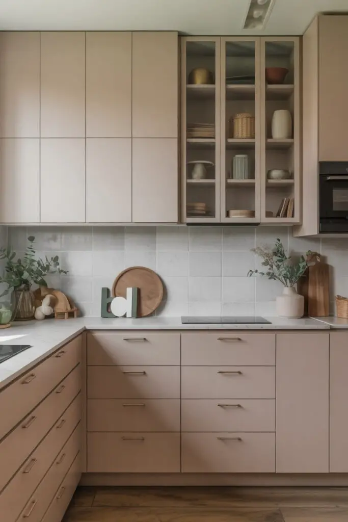
- Using too many bold colors at once — pick one hero.
- Forgetting natural light impact.
- Choosing color without considering long-term love for it.
Conclusion: Confidence is the Secret Ingredient
Designing a luxury kitchen with a bold color scheme isn’t about shouting the loudest — it’s about speaking clearly, with style and intention.
If you:
- Choose one confident, timeless bold color,
- Pair it with high-quality finishes and balanced neutrals,
- Layer in thoughtful lighting and texture,
…you’ll have a kitchen that turns heads now and still wows in a decade.
And honestly? The boldest thing you can do is create a space that makes you grin every time you walk in — even before your morning coffee. 🙂